

table of contents

previous articles

next articles
Feature article


CONTENTS
Our Central Park
This mixed-use development in Chippendale has built a new neighbourhood, David Tickle takes a look at what has defined its success.
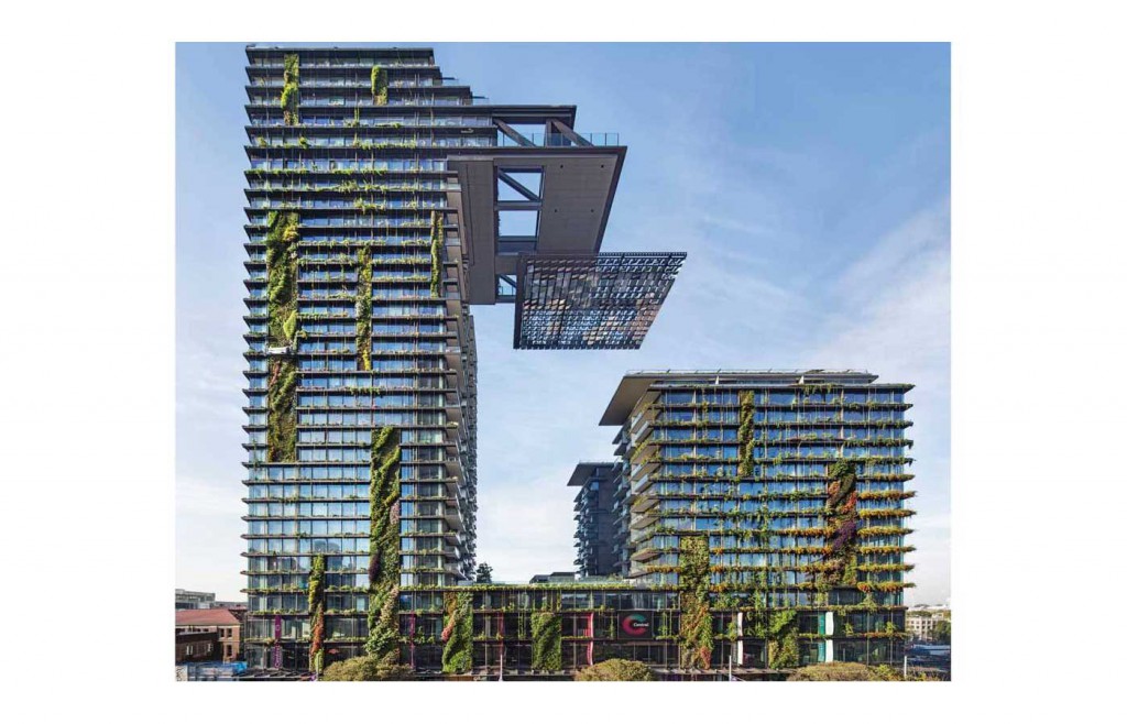
There is the citation from the Council for Tall Buildings and Urban Habitat who in recognising the main tower as the Best Tall Building Worldwide in 2014, spoke as much as about the amenity surrounding the building – the extension of landscape, the creation of “planted plateueas” and “green urban sculpture”. And then there is the project website, with its team of architects – from Foster and Nouvel to Tzannes and JPW – who speak of the aspiration to create more than just buildings: a new model of city neighbourhood, an urban landscape, a contemporary place.
And, of course, there is the name.
The park is, well, central to the story of Central Park.
There was never doubt this was going to be a significant project for Sydney. It is a major inner urban site, sandwiched between city centre and rough-and-tumble Chippendale. Locked away from public access for decades, but in the minds of many, a public asset – a beer factory, a multi-generational employer and a place of social and physical heritage. It was a two-billion dollar development exercise, a 5.8 hectare site, but first and foremost an opportunity to do urban renewal well.
With all such projects in Sydney, the realisation of Central Park has taken a long and convoluted path, through a rotation of developers, design teams and approval authorities. Australand first purchased an option to develop the site in 2003, but following an invited master planning competition and some wrangling with the City of Sydney, withdrew from the project two years later. Singaporean-based Frasers acquired the site in 2007 (and ultimately, Australand some years later), and with a refreshed design team, sought approval via the state government instead. The vision for the site, led personally by Frasers’ chairman of the time, Stanley Quek, promised a whole new paradigm in urban living.
The revised plan was able to accommodate two seemingly contradictory outcomes – an increase in floor space as well as green space. This was done by contracting building footprints, pushing floor space higher into towers (elevating the value of the residential also, no doubt) and trading in street and pavement for landscape. It was a clever move, one that optimised the commercial outcomes of the site, along with the promise of greater community benefit.
The earlier masterplans for the site, including that supported by the City of Sydney, envisaged its main open space as a linear park, running north-south between Broadway and Chippendale. As this plan evolved, a key decision was to reform this space – a simple rectangle, placed against the Chippendale edge. Thus, the central (more accurately, off-central) park was born.
The relocation of the park was key. It no longer was the mediator of two urban conditions; liberated from its city edge and any aspiration for this to be a civic space. It was now a local park, a space for residents, both new and existing. It needed to be more open, more unrestrained, more Chippendale.
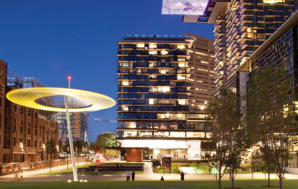
The space itself is simple – crossed by two orthogonal pathways that define a number of grassed terraces. The park’s amenities include a barbeque to the side, a water cascade and an understated artwork. The detailing is unfussy and robust, with a restrained palette of materials. And importantly, the edges of the park are open, allowing access at almost any point. This openness means that the space is used by dog walkers and joggers, picnickers and pop-up marketeers, dance battlers and cos-players. It is a space that understands that the most critical ingredient for the success of a place is simply people.
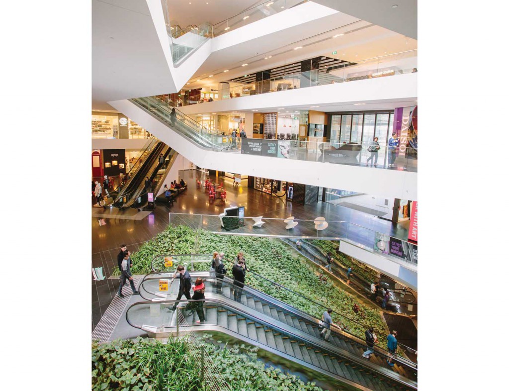
Then there are all the other spaces – a sunken courtyard for eating and drinking, the newly opened Spice Alley, a shopping centre that doubles as a games arcade and art gallery. These are places of intimacy, compression, intensity, in contrast to the simple openness of the main park space.
In total, Central Park has delivered more than 30,000 square metres of open space. For comparison, the new Barangaroo Headland Park is 60,000 square metres. If we measured such things, the open space ratio of the site would be 0.5:1. This is quite a feat for a dense, inner city development site.
The name Central Park clearly invites the comparison with its New York namesake, and despite the difference in location, age and scale, there are some interesting parallels. The original Central Park was created in the mid-nineteenth century as New York was rapidly growing – a landscape foil to the noise and congestion of the city. Its urban edge is now intensively developed on all sides. Green and grey work as a complementary pair: the generosity of the park, the multitude of activities and experiences it houses, allow for greater building density; in turn, the buildings define and enliven the park. Our Central Park is almost a scaled-down version of this model – where the spaces between buildings generate as much interest and value as the buildings themselves.
While Central Park, New York was envisaged and delivered as a public project, it is managed by the Central Park Conservancy, a not-for-profit private organisation. The Sydney version also relies on the partnership of private and public interest – not in the formal sense, but in understanding that a market-driven development can also deliver meaningful public spaces for the city. In fact, it relies upon them – not just to justify higher densities, but to create more authentic and engaging urban places.
It is an inclusive and optimistic view of urban renewal, one where commercial and community outcomes are seen as complementary, not competing, forces.
David Tickle
Principal, HASSELL


