

table of contents

previous articles

next articles
Feature article


CONTENTS
Enduring Architecture Award: Reader’s Digest Building
Cooper & Waterloo Streets, Surry Hills
John James & Associates, 1963–68
Designed by the architect John James to fill an entire block once occupied by the stables for Toohey’s Standard Brewery, the Australian headquarters for Reader’s Digest was officially opened in 1967. James’ design was founded on completely different principles to that of mainstream commercial office buildings in the 1960s. He designed according to humanist principles, which were reflected in the material used throughout the building, the façade rhythms derived from the naturally occurring spiral (explained in mathematical terms by the Fibonacci series), the pattern of fenestration and the creation of a rooftop garden. The architectural historian Jennifer Taylor commented that
This intriguing building stands well outside the mainstream but for office buildings, it represented a unique clear break from the regimented logic of the structural grid that dominated the city architecture for the preceding decade. It is a visually rich building with the concrete fashioned with care to create a gentle and humane setting … the curved organic patterns of the facades are the outcome of the combination of the study of the practical aspects of building, in this case the behaviour of rain on surfaces, with a love of sculptured form. (Taylor, 1990)
James’ inspirations for the design were varied, he cites Cullen’s Townscape as being influential and did not want to divorce the building from the pavement in the way that modern office buildings frequently did, preferring to have the building ‘grow out of the street in the way of Italian Renaissance Palazzi’. (James 1987)
James collaborated with the landscape architect Bruce Mackenzie and the sculptor Douglas Annand. Not all of the sculptures made for the building were permanently installed, as the client found them to be too suggestive. Great care was taken with the colour of the concrete to obtain a warm exterior that was sympathetic with the materials used in the foyer: bronze, bronzed glass, travertine and brown brick.
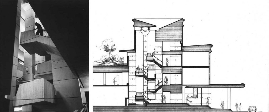
The main stair hall, designed to impart a vigorous movement that turns first in one direction and then in another to enliven the space, retains this quality today. (James, 1987)
Computers were in their infancy when this building was designed. James notes that this is the first office building in Sydney to be specifically designed to accommodate a computer and the machine could be seen in operation through windows in the foyer. Mainframe computers were such a novelty that a viewing window was also installed in the Physics building at the University of Sydney.
The rooftop garden was the result of James’ analysis of the surrounding suburb, he later commented that ‘there were so few parks in Surry Hills that we wanted to offer the staff a garden of their own’. (James, 1987). One of the conditions imposed by the City of Sydney during the 2007 works was that the roof garden is retained for the enjoyment of all occupants.
The Reader’s Digest Building has undergone two phases of work for new owners and occupiers, in 1993 and more recently in 2007. During both sets of works, discussions were held with John James so that the original design concept could be understood. The Reader’s Digest Building has now been listed by the City of Sydney on its schedule of items of environmental heritage, including its interiors and landscaping. Reader’s Digest is the fourth building in the Sydney local government area to be the subject of an environmental upgrade agreement, which will see the environmental performance of the building improved. The use of a masonry exterior means that the Reader’s Digest Building was initially designed to outperform the typical modern office buildings that James considered to be ‘reflective glass cages’. (James, 1987)
The 2016 NSW Award for Enduring Architecture was given to the (former) Reader’s Digest Building as it was and remains a highly significant building – the work of three prominent and greatly respected designers from the second half of the 20th century: the architect and scholar John James, designer and sculptor Douglas Annand and landscape architect Bruce Mackenzie. The building has great importance in the context of post World War II commercial architecture because of its accomplished, rare and distinctive aesthetic expression that combined architecture, sculpture and landscaping and because of its placement outside the architectural mainstream of the 1960s.
Noni Boyd is heritage officer at the NSW Chapter of the Australian Institute of Architects
SOURCES
Jennifer Taylor, 1990, Australian Architecture since 1960, p 89
Reader’s Digest Building – Fact Sheet held in the NSW Chapter Digital Archive, including notes on the design prepared by John James in 1987
DOCOMOMO fiche for the Reader’s Digest Building, 2003
2016 NSW architecture awards –
About the Award for Enduring Architecture
Following on from similar awards in America, England and New Zealand, the 25 Year Award (established 2003) was renamed the Award for Enduring Architecture with past winners including the Sydney Opera House. Open to buildings of at least 25 years of age, this award recognises achievement for the design of buildings of outstanding merit that remain important as high-quality works of architecture when considered in a contemporary context.
JURY
Hector Abrahams, Hector Abrahams Architects
Jean Rice, Jean Rice Architect
George Philips, Tanner Kibble Denton Architects
Selection of the Reader’s Digest Building as this year’s recipient of the NSW Enduring Architecture Award was a difficult one for the jury, as all of the shortlisted entries were of high calibre and similarly worthy. Completed in 1968, the building stands out for its unique architectural expression – rigorously executed externally and internally – and for its successful synthesis of architecture, landscape and sculpture, enlivening what could otherwise have been a conventional office building.
Jury statement


